eta: this is the same wallpaper shown in the March issue of Your Home and Garden!
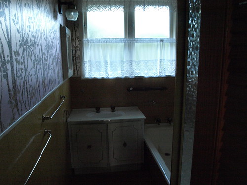
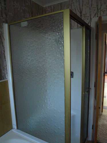
Remember how my little brother visited us before Christmas and
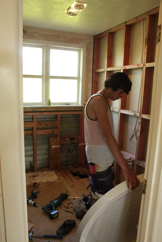
Sam installing the shower base. After he had put in the shower he told us how it was the first one he had ever done...... Luckily the bathroom turned out better than all right!
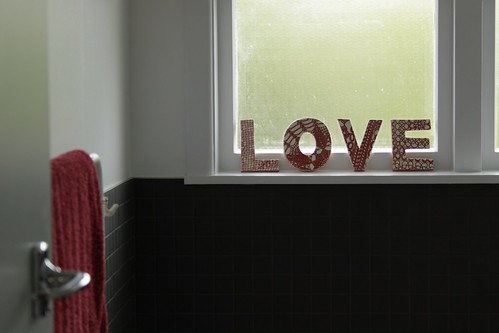
Those sneaky L.O.V.E. letters popping up again.
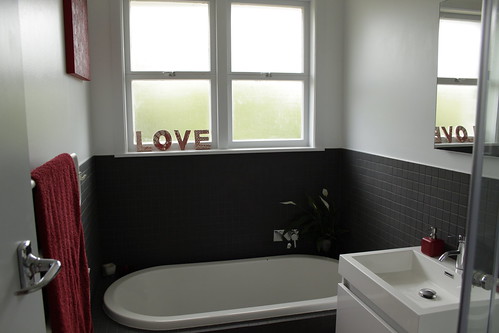
We left the shower in the same spot, but switched the bath and vanity around so now the bath runs under the window. The vanity is wall hung, so it doesn't touch the floor. There is a small gap between the sides of the vanity and the bath and the shower- I think that all these things contribute to making the bathroom feel much bigger then it did before. White walls never hurt the cause either!
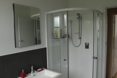
We chose a shower with a curved base, so it is a quarter round. the doors open by sliding around inside the shower, and don't open into the room, so the shower has less of a footprint than the last shower. Also because it is transparent glass, it helps the room feel larger.
We also put in a mirror cabinet above the sink. It is recessed back into the wall, and holds all our toiletries.
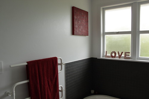
We tiled around the bath and vanity, and put in a heated towel rail, which is just blissful.
As per the rest of the house, I've accessorised with red. Take away the red, and you have a blank slate with which to add any colour you please, but for now, I'm still loving the red.
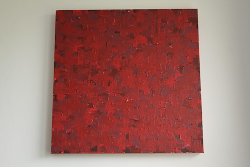
I painted this using a square canvas and something called modelling medium, making up shades of red as I went and painting them on in cross shapes. It took 3 or 4 painting sessions, building it up and covering the white canvas slowly. I'm really pleased with how it turned out.

