I bet it looked awesome when it was done. So modern and cutting edge. What a risky choice.
I wonder what The Homeowner will be saying 30 years from now about our decisions?!
That mirror tile is coming down. I think when they put the mirror tile wall into the bathroom - another excellent decorating choice- they must have had a few left over, because they're stuck all over the house. I'm a bit concerned about cracking it as we pry it off the wall. Because 7 years bad luck is all anyone needs while they're renovating.
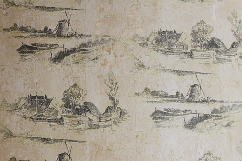
Needless to say we discovered it under the layer of orange and yellow geometric paper that is currently gracing the office/spare room. (1970, GET OUT OF MY HOUSE!)
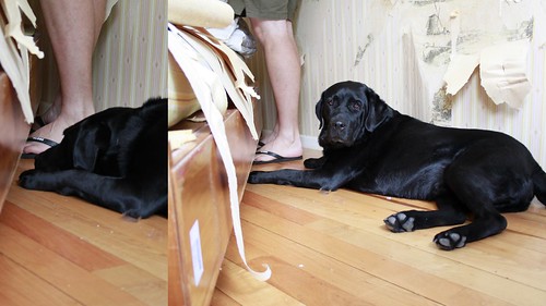
Helper dog spent most of his time supervising. (Actually in the interests of full disclosure, I just took the photos while Mr Husband did the hard work. I was in the middle of making a batch of muffins I forgot to put the sugar in.)

Needless to say we discovered it under the layer of orange and yellow geometric paper that is currently gracing the office/spare room. (1970, GET OUT OF MY HOUSE!)

Helper dog spent most of his time supervising. (Actually in the interests of full disclosure, I just took the photos while Mr Husband did the hard work. I was in the middle of making a batch of muffins I forgot to put the sugar in.)

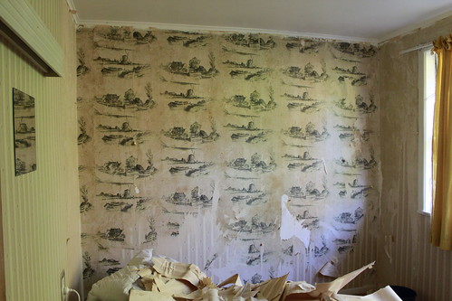



what gets me is those feature walls and geometric patterns never look exactly straight/ square.
ReplyDeleteMaybe back in the 70s people's glasses were a bit squew wiff?
Great to get on to this you will love the results.